 E
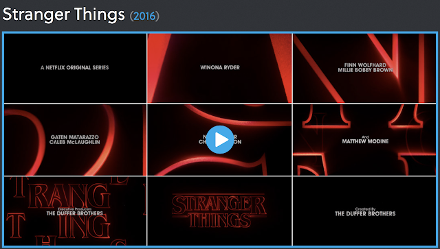
EThe primary typeface is Benguiat, carefully chosen for its deep associations with early ’80s Stephen King paperbacks, the Choose Your Own Adventure series, and other dusty, musty touchstones.The Stranger Things opening is not only a fitting successor to a revered title design tradition, but a testament to the power of type in motion and the enormous potency of nostalgia. The title sequence of stranger things is very effective at putting across the aura of the series. The link to the art of the title page: https://www.artofthetitle.com/title/stranger-things/
The dramatic music in the background sets a creepy tone, as if something bad is about to happen and the characters will face an inter dimensional force to tackle. The neon red letters convey the typical neon writing that was used for restaurants etc. in the 90's which suggests that this is a series based in that era. These are shown one by one in a zoom shot and fluently link together to spell out the name of the series.
The different names (credits) put in the middle, with the neon letters in the background have very simple, white writing. Almost to not draw attention away from the neon letters and to emphasise the fact they are to spell out a bigger picture. The plain black background used throughout the title sequence conveys a dark gloomy atmosphere which sets up the scene for a scary series. This makes sense as the genre of 'Stranger things' is classed under science fiction and horror. The black background provokes fear in the audience as red is used to signify blood and black is used to signify darkness and the unknown. Also we don't see any of the characters or any key locations in the title sequence which gives the audience a sense of mystery and draws them in to keep watching to discover the antagonist and the other characters.
The editing of the title sequence is clever as it uses a fade which helps the title look more fluent and as if it is fading into the darkness, when the title finally becomes one it stands out to the audience in a zooming out shot. There is a long period of darkness after the title fades away which causes the audience to anticipate what is going to happen next and helps to reel them in.
Personally, I really like this title sequence and I think it takes a unique approach and turns to simplicity instead of jam-packing it with dramatic shots. This is effective as it conveys a major sense of mystery which increases the chance of the audience watching on as they want to find out what the series is about and what will unfold because it is largely left unclear.
Good: thoughtful comments. You respond to the mystery, the use of colour and the choice of typography.
ReplyDelete